
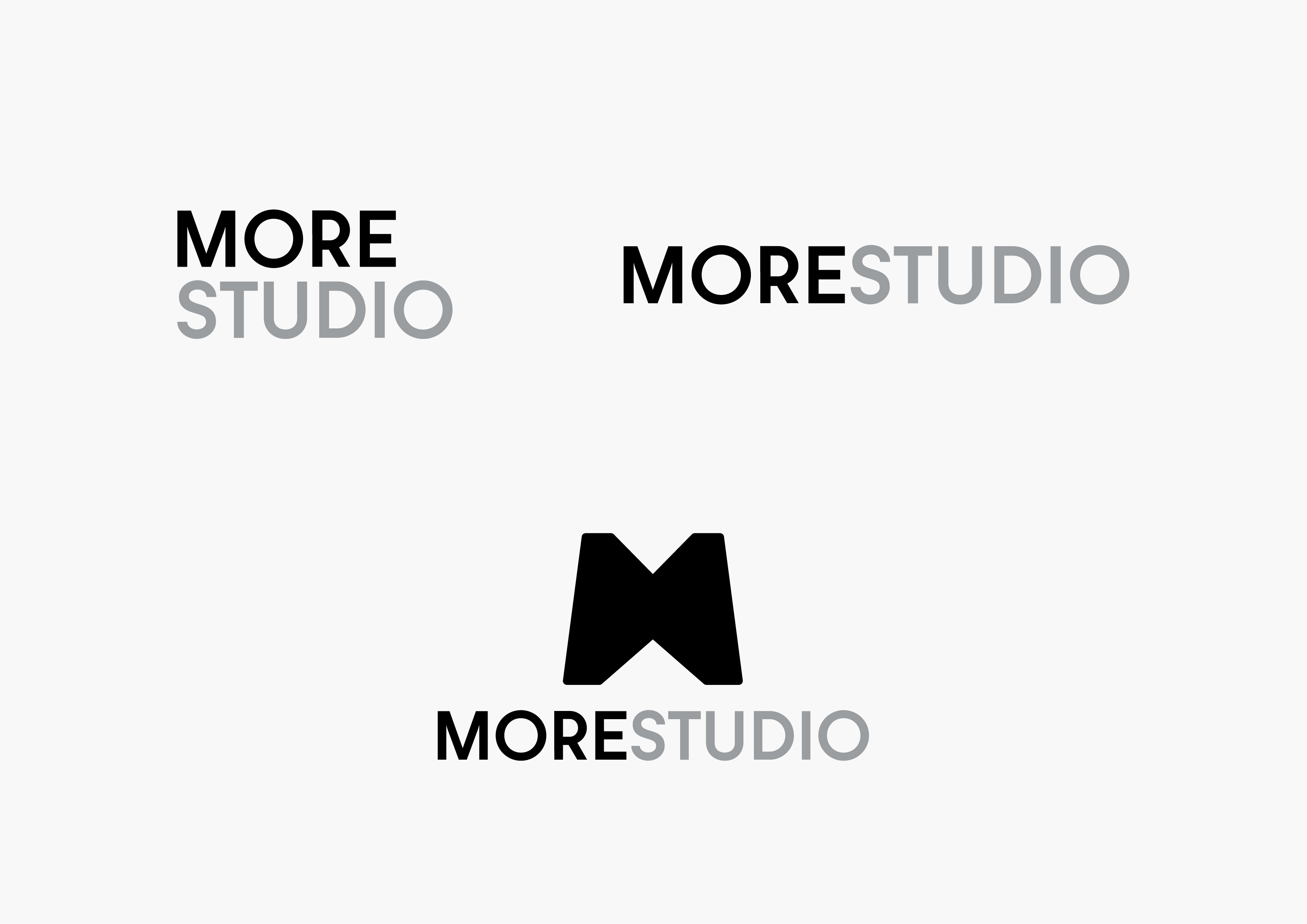

Brand Symbol
This symbol was designed from an arrow merged in both positive and negative space to become ‘M’ alphabet.
The arrow’s meaning is from MORE’s philosophy that is to guide their customer to a better and purposeful direction.
It is also a universal symbol that represents forward and play.


Graphic elements
![]()


